← Methadone Campaign (previous entry)
(next entry) Environment Agency Signage →
ARKeX Brand Guidelines
ARKeX are a company that provides geophysical data to enable clients to quickly and cost effectively improve the understanding of their subsurface earth models when exploring for oil and gas.
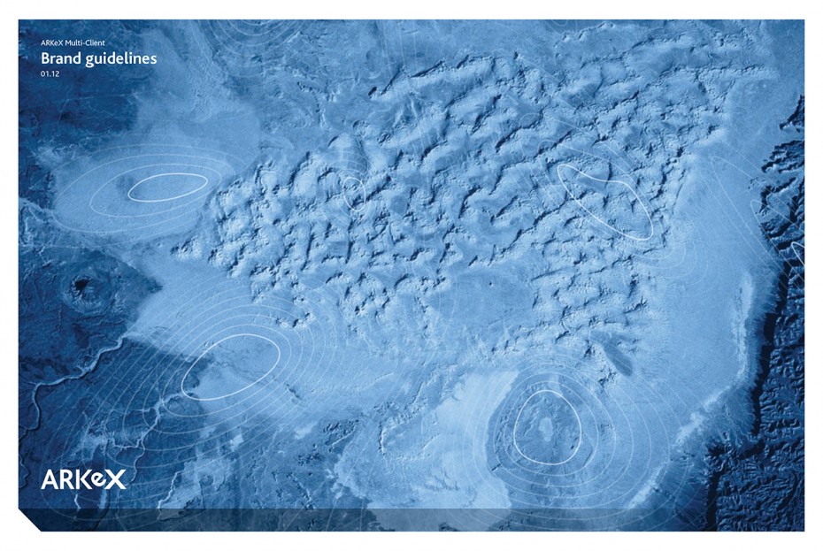
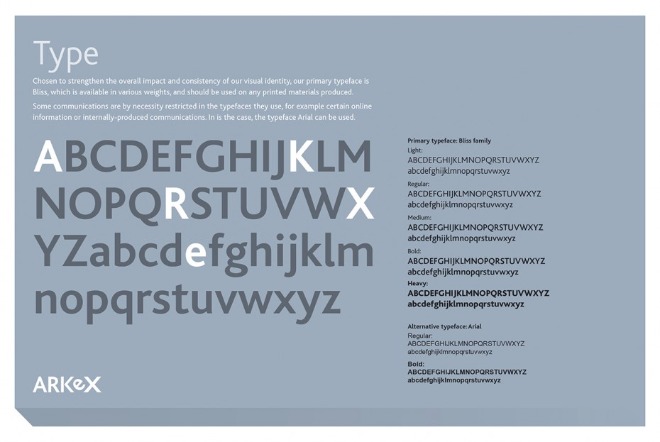
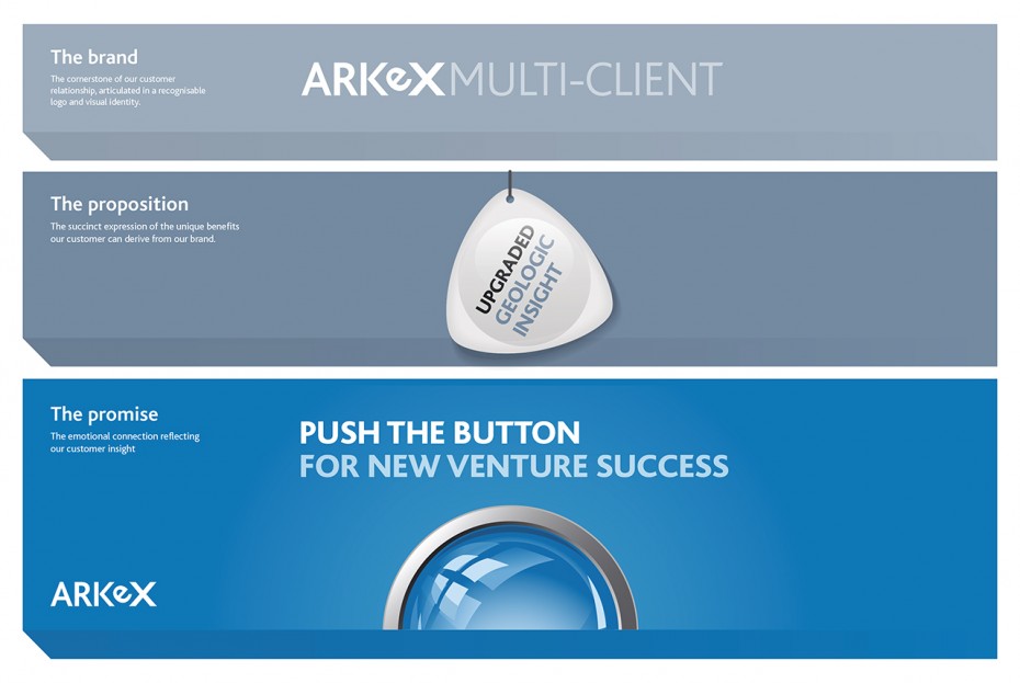
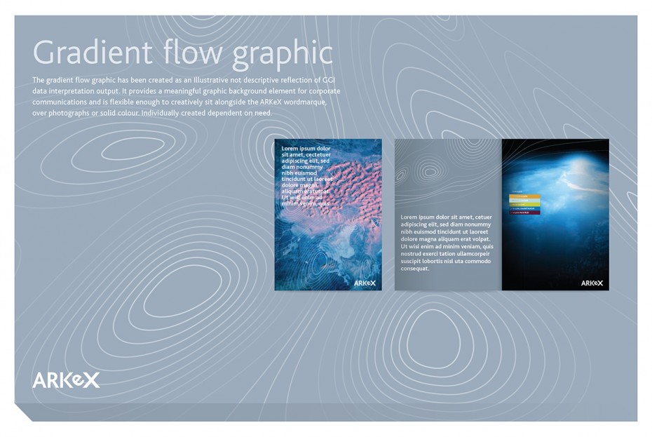
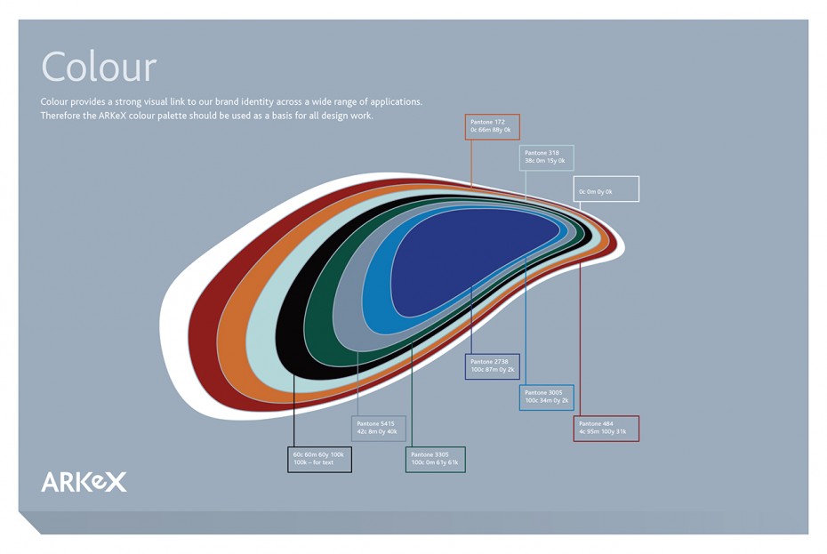
We used these geophysical flows as a core element when developing the brands visual language and while the word mark is simple, it uses the typographic symmetry of the letters to create a mark that is flexible and memorable. This was important as the ARKeX brand had to handshake with other subsidiary brands including Multi-Client.

