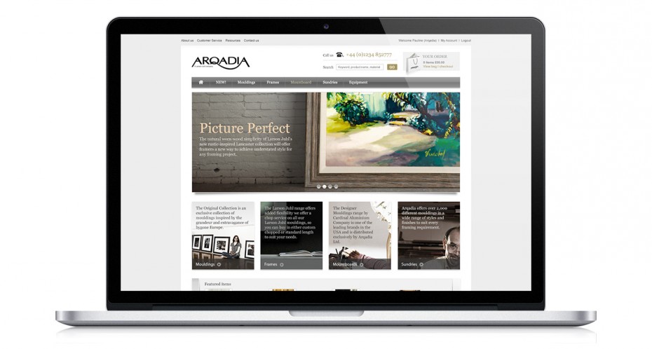
“An e-commerce platform with a focus on elegant simplicty”
The new website would have to work far harder than the previous one. Rather than plonking a traditional catalogue online, which they had done previously we proposed a fully functioning e-commerce platform with high levels of usability in order to maximise their online presence.
Given the breadth and depth of the Arqadia offer it was vital to think like the likely site visitor. Understanding their needs was crucial in order to build the best possible user experience. We developed an information architecture that avoided getting too deep and an interface that was unfussy and allowed the user to find what they are looking for easily.
Wireframes played a big part in scrutinising the customer journey and streamlining the process. We mapped out every interaction that a visitor might have with the site including the all important ordering and delivery process to ensure there would not be any disconnects in their user experience.
Once happy with the wireframes, the skin could be developed. A considerable number of templates needed to be created and so the wireframes played a crucial role in ensuring consistency and coherence as the user interacted with different aspects of the site. Given that product is king and usability is critical to this type of site the look and feel is paired back yet still elegant.

Also within the site, we were asked to make provision for bringing their trade magazine 4 Walls to life in an online format. Rather than just slapping up a downloadable PDF we used the format and technology to create a richer more immersive experience for the visitor.


