Digitally fit for purpose
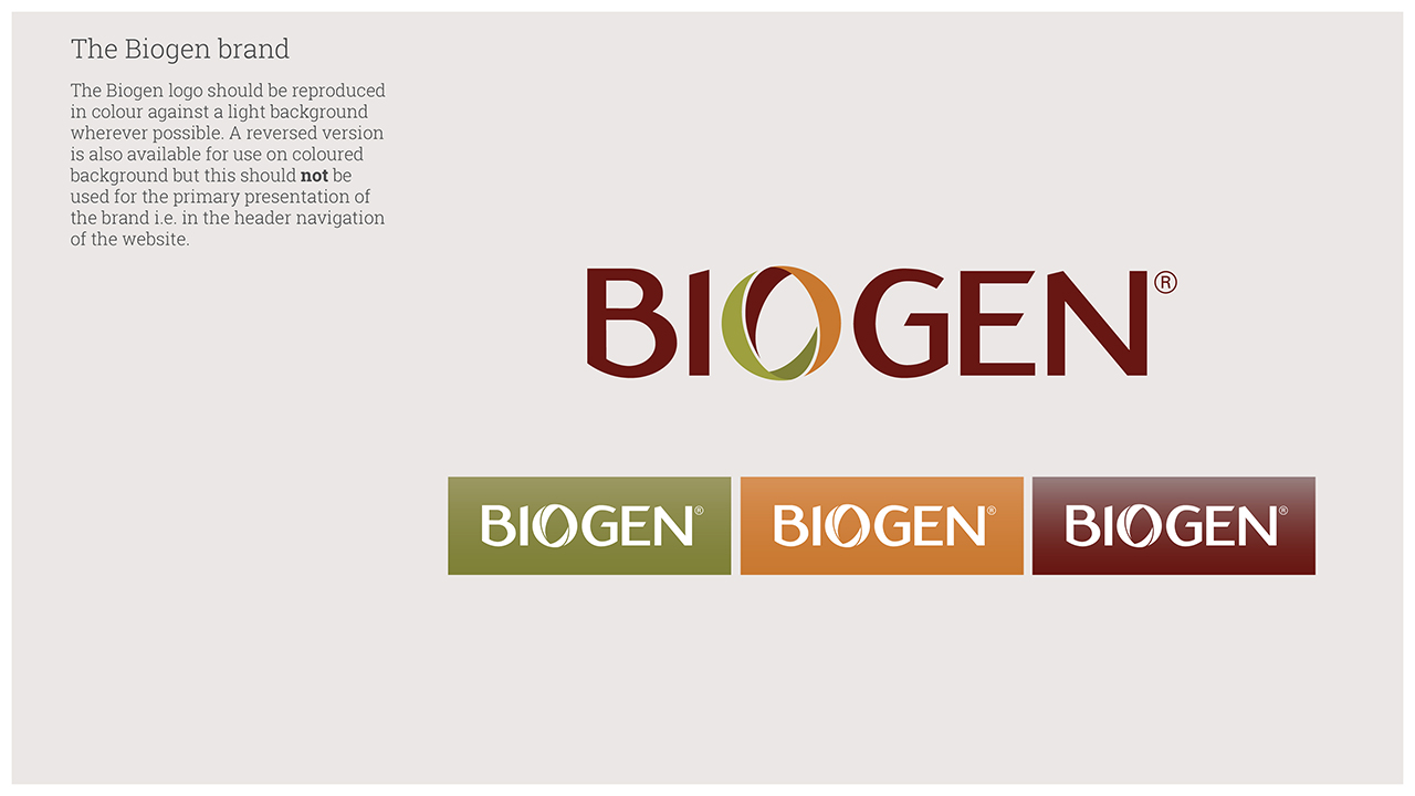
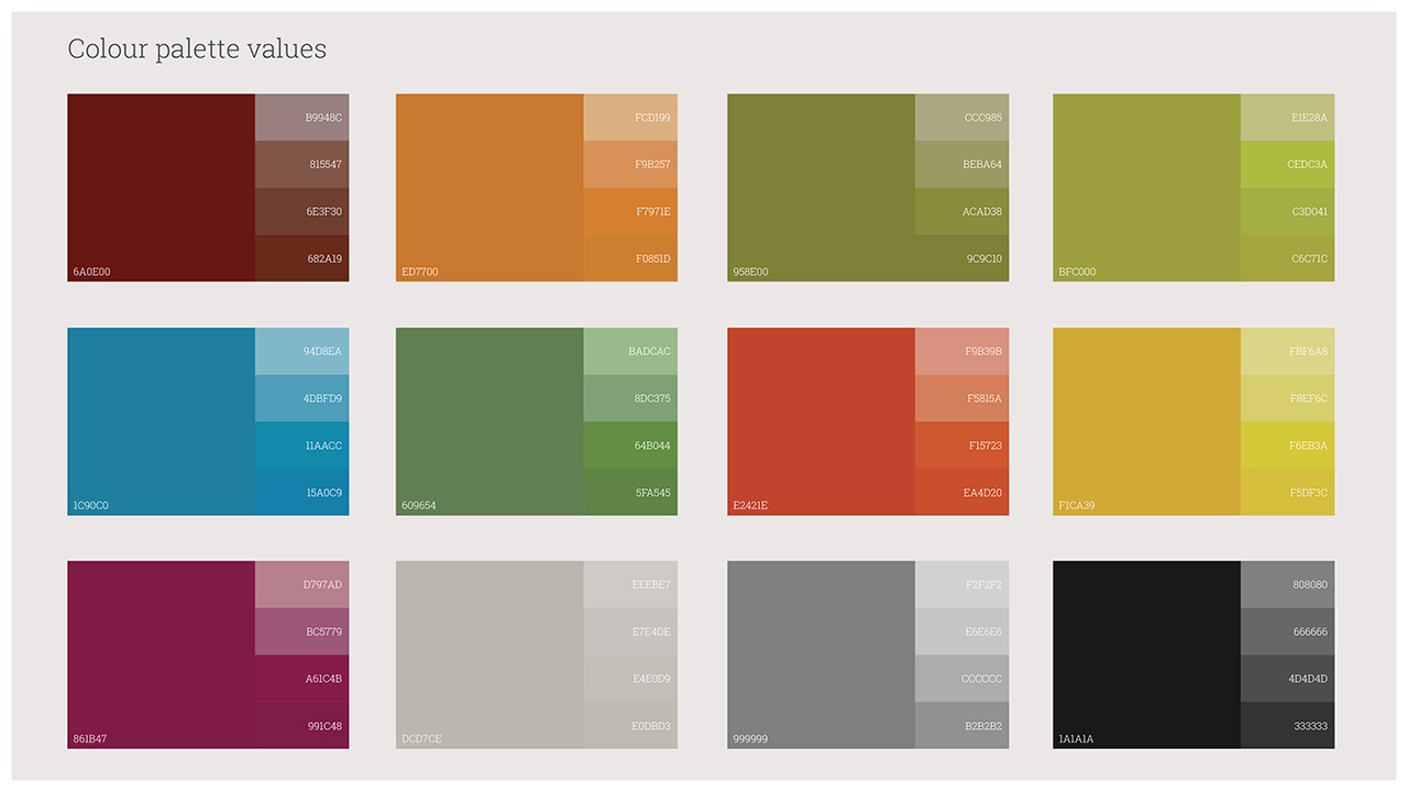
Based on the existing Biogen masterbrand guidelines, develop a fit-for-purpose digital equivalent, delivering it in toolkit format to enable easy assimilation, interpretation and deployment by third party suppliers specifically web development teams.
While the masterbrand guidelines offered a robust platform for developing print based solutions, a literal translation of these into the digital space would not have been successful.
The goal was to retain the overall ‘feel’ of the brand but make it work successfully online. To achieve this all components of the brand were re-evaluated.
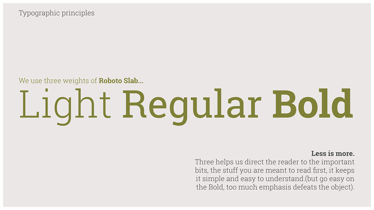
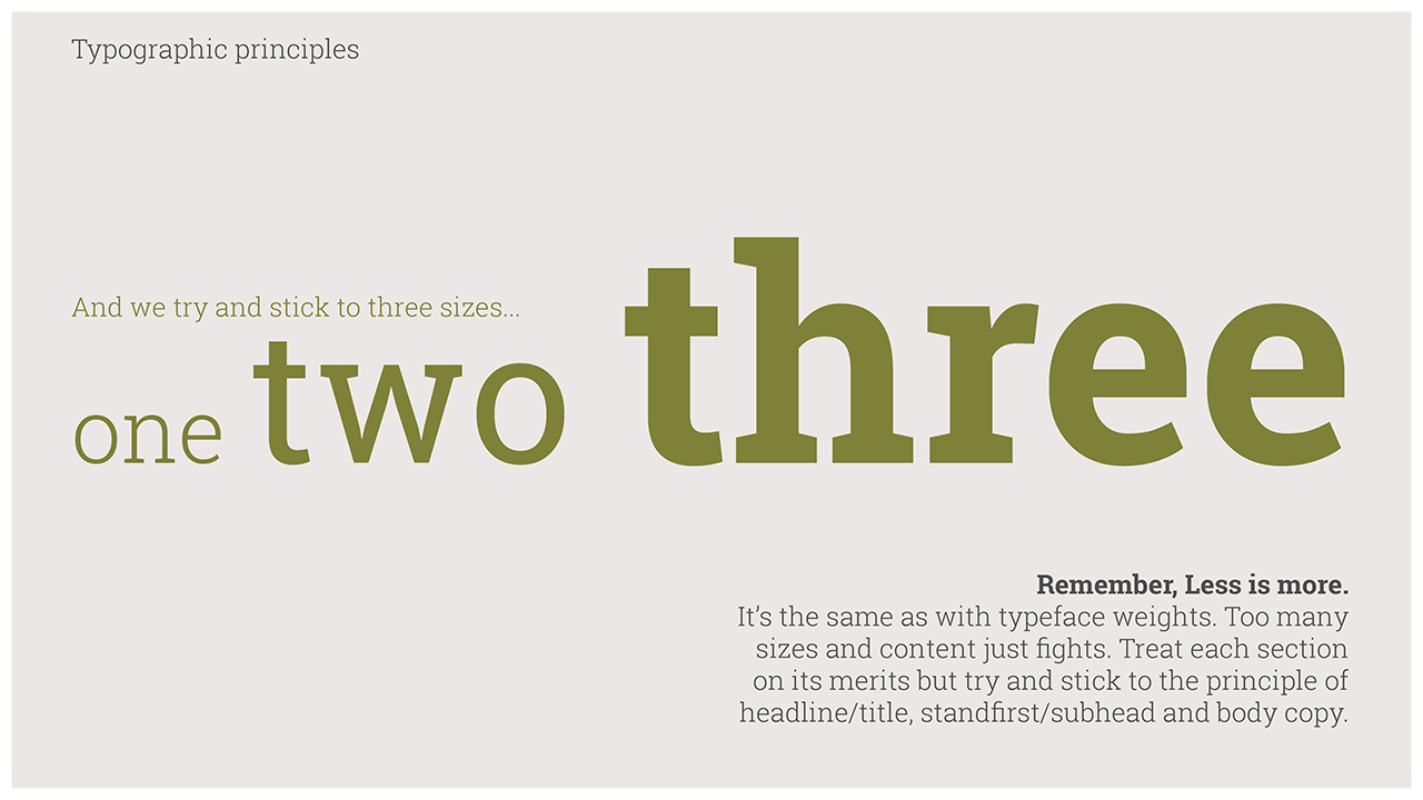
Typographic principles for example were completely overhauled because the existing ones being used on print comms broke up and did not reproduce to an acceptable standard at small sizes.
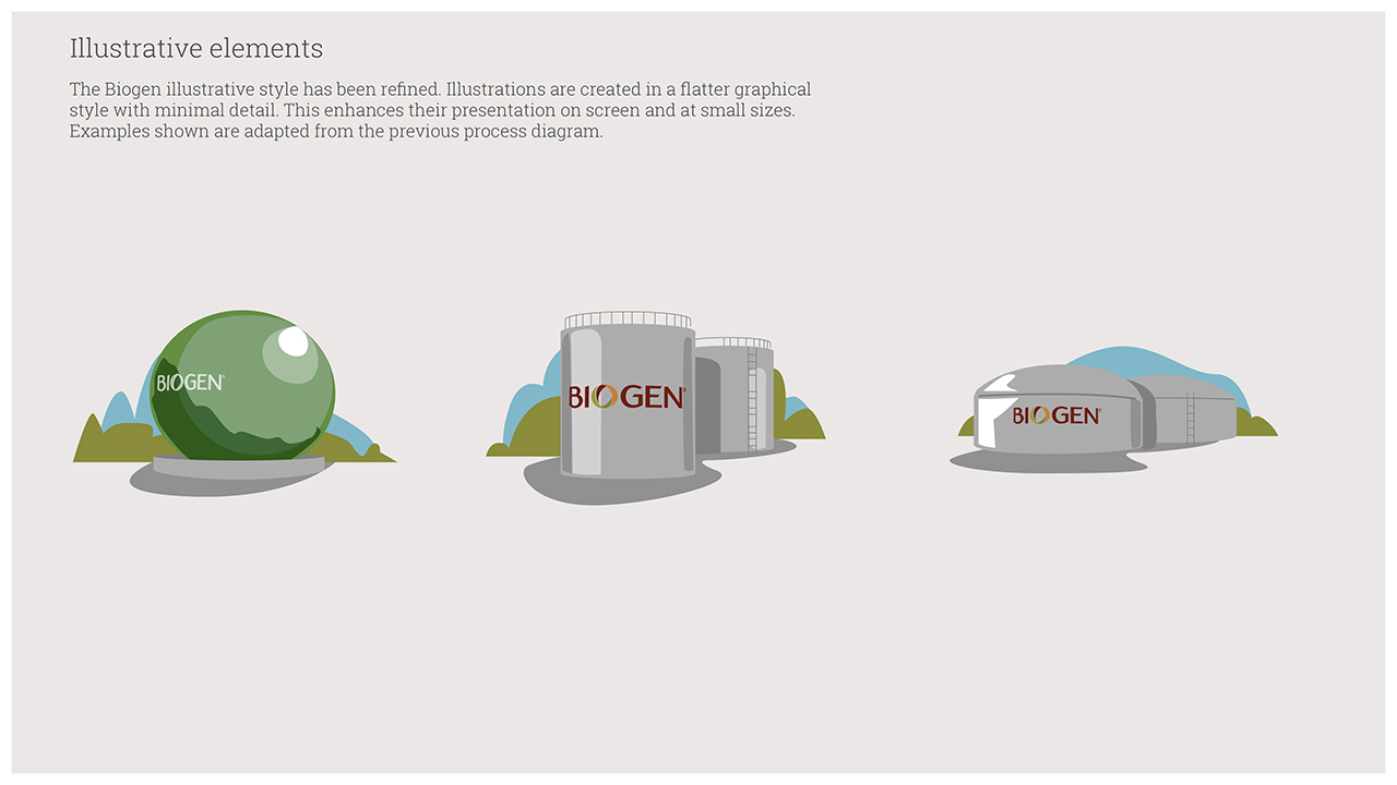
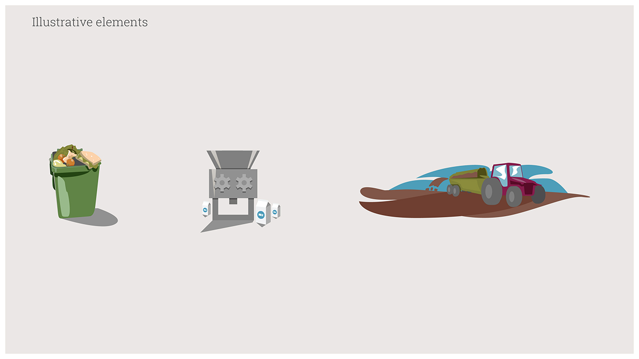
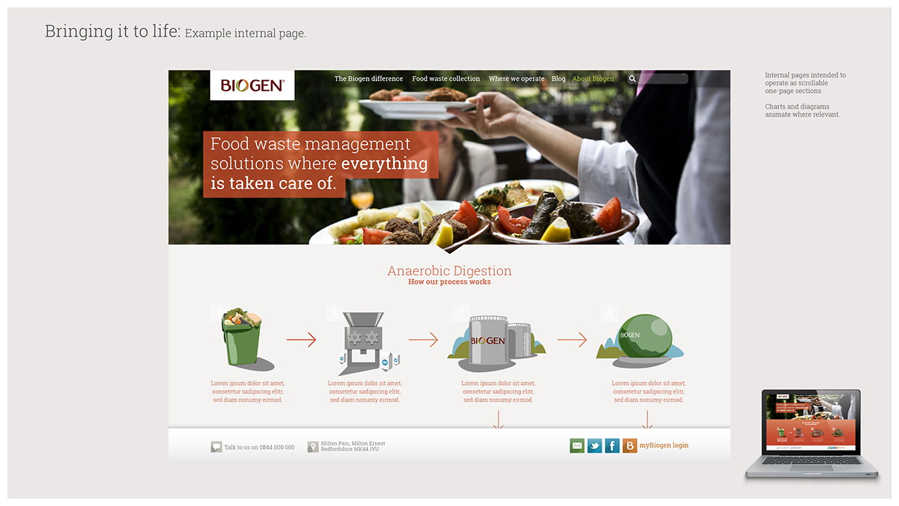
The illustrative components were also simplified, losing the complex linework and shading style, replacing it instead with stripped back flat colour approach.
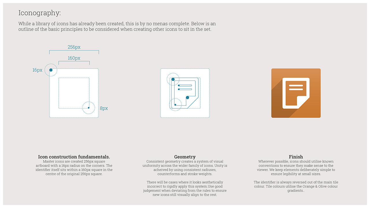
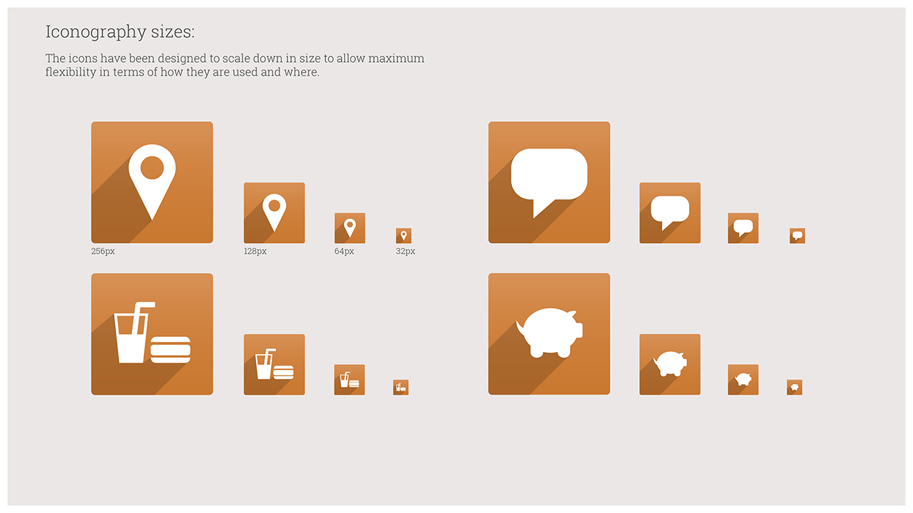
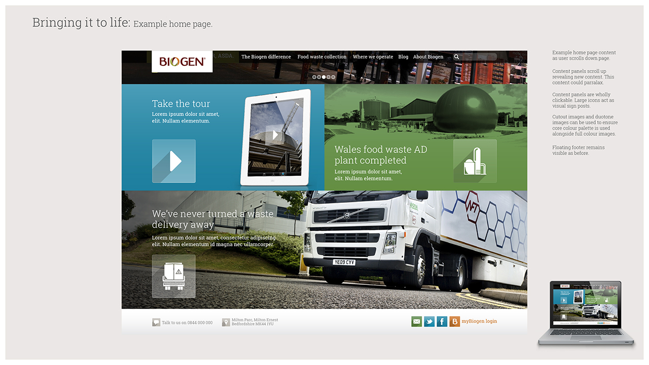
A whole suite of iconography was developed to aid the signposting of content in a clean and elegant way. Alongside this a set of guidance principles were also created to enable third parties to develop additional iconography in a consistent manner as and when required.
Another key component was the use and deployment of photographic imagery, an area that had been much abused both internally and by external suppliers.
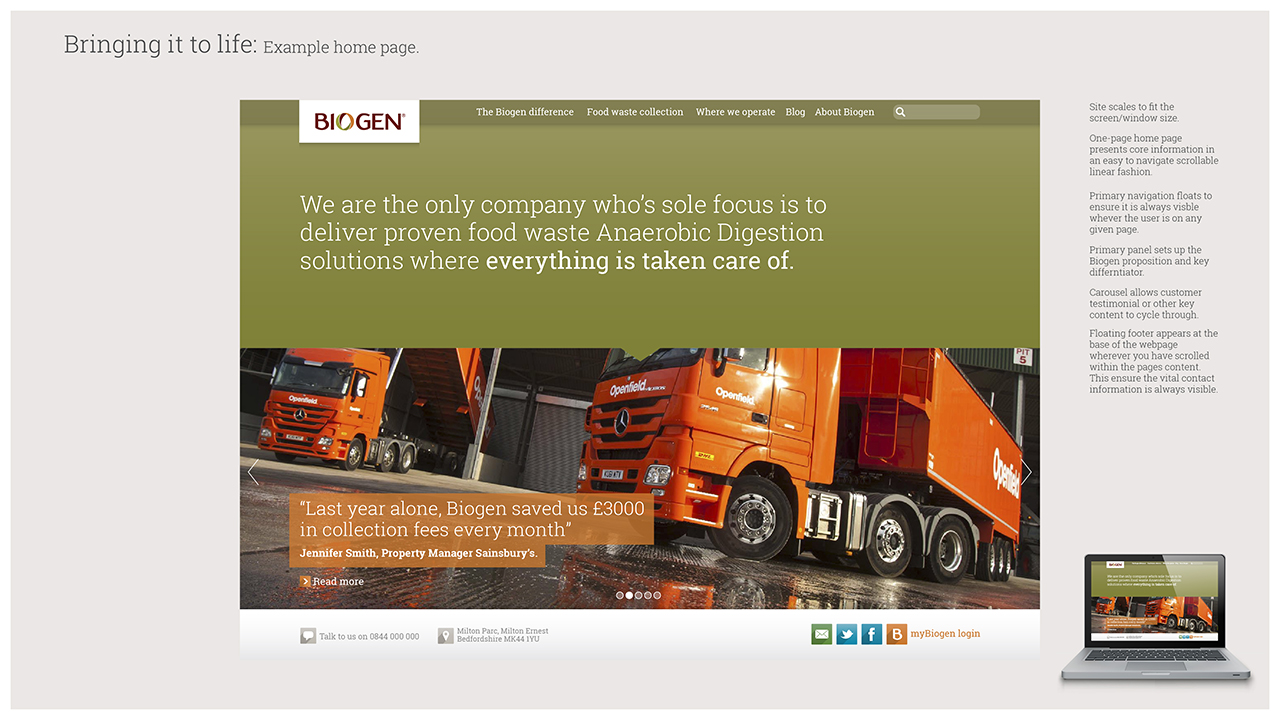
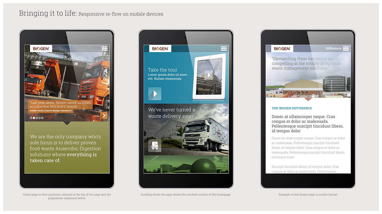
The development of these guidelines dovetailed with the requirement to redesign their website and so as part of the toolkit the newly developed principles were applied to the design of a number of responsive web pages that would act as a guiding light to the company developing the site.

