Peppadew Website
Brief:
The Peppadew brand has outgrown its existing site and to be honest the design is looking very tired. Given a number of product extensions are expected to be added over the next 12-18 months the new site needs to factor this in as well as presenting the brand and its products in a consumer friendly manner.
Solution:
Before any design work started, a thorough piece of research was carried out. This looked closely at who was already buying the product and profiles were built up on them. The same was done for potential new audiences the brand was looking to attract. With these personas front of mind, customer journeys were mapped out. From here wireframes and paper prototypes were created so that we could ensure all bases were being covered.
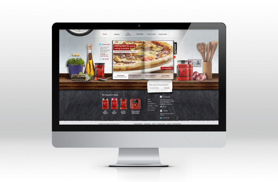
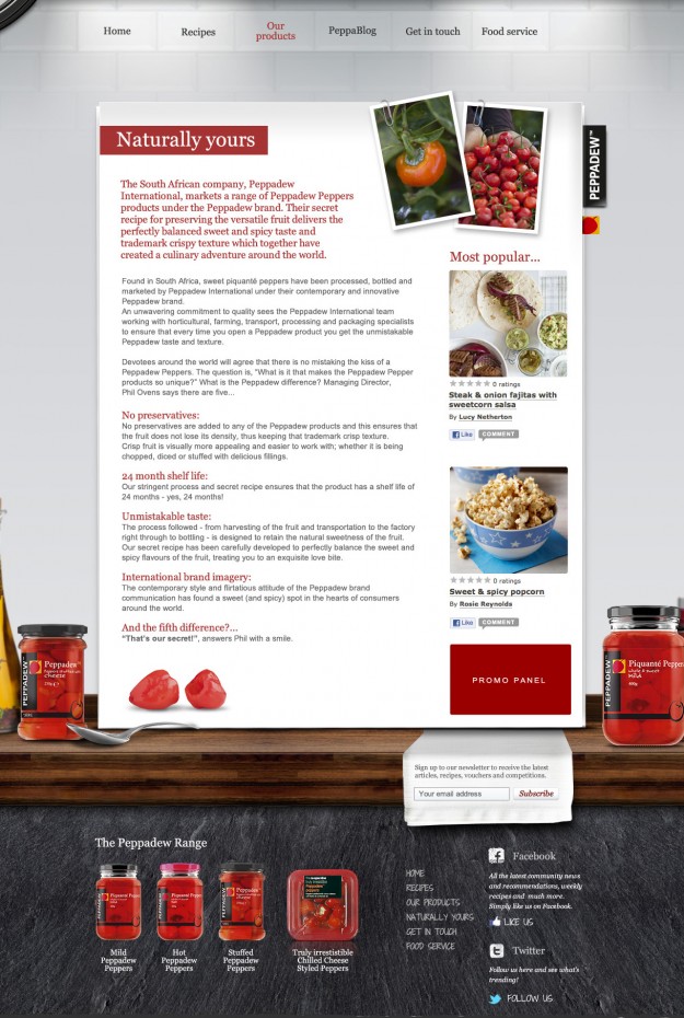
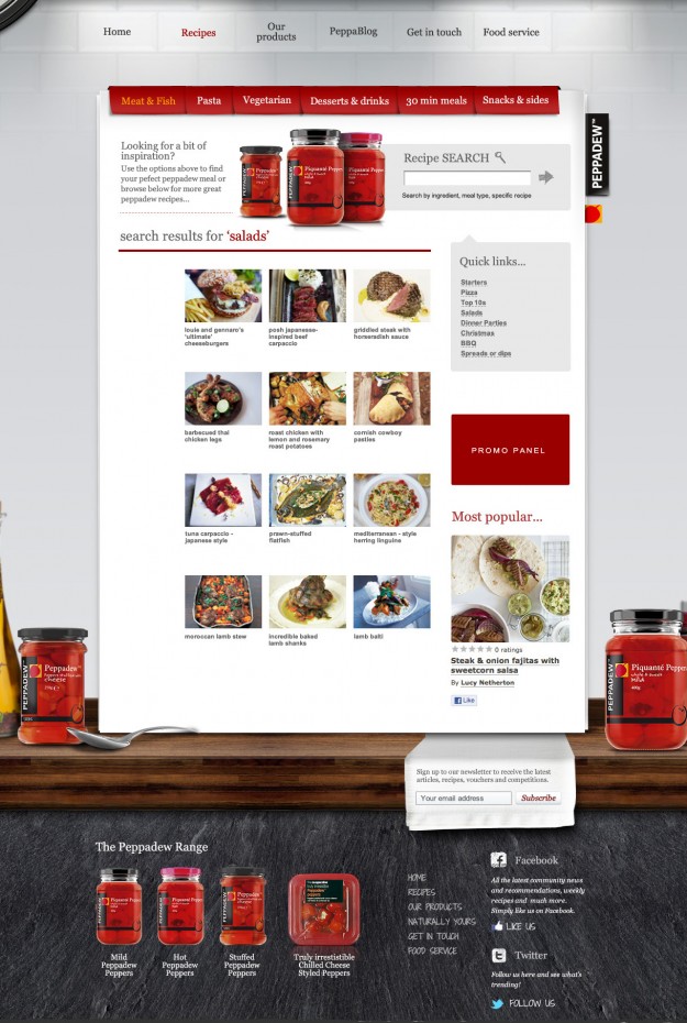
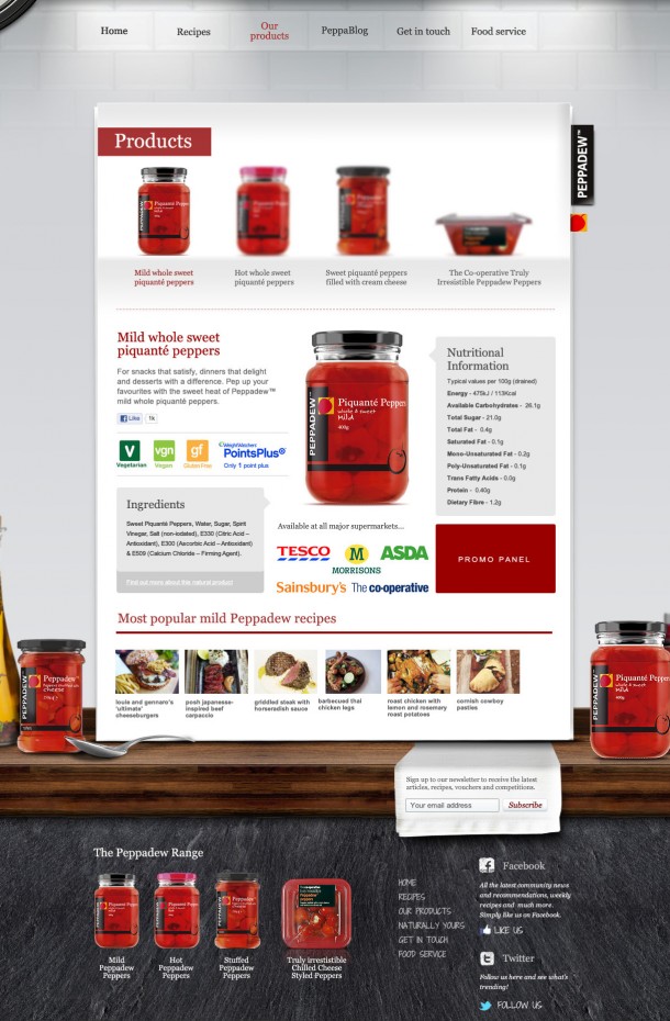
Once we were happy with the architecture of the site we looked at how a creative skin would bring it to life. We centred on a kitchen type environment given that whether using the products in a recipe or preparing them as nibbles we knew we would be able to swap background elements in and out to ensure they matched the content of the page. This flexibility would also be useful when localising the content for different territories.


