← Wolf Blass Lightweighting (previous entry)
(next entry) Biogen Digital Guidelines →
Peppadew Brand
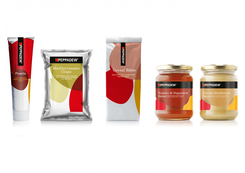
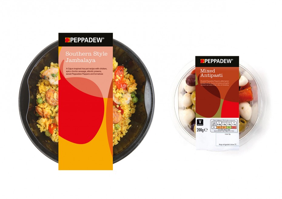
While the original brand mark was much loved it was not fit for purpose when applied to different packaging formats.
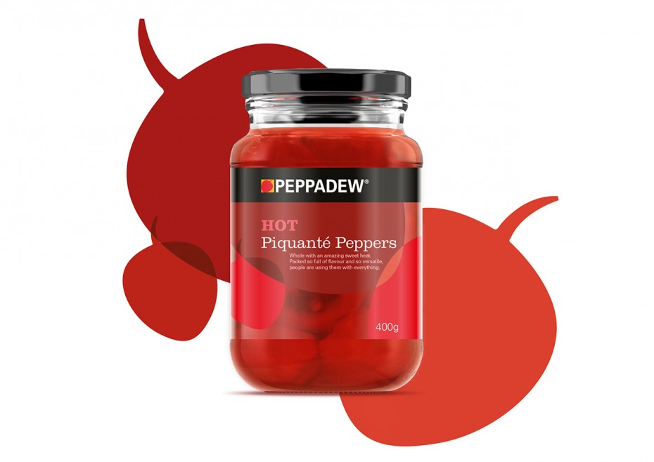
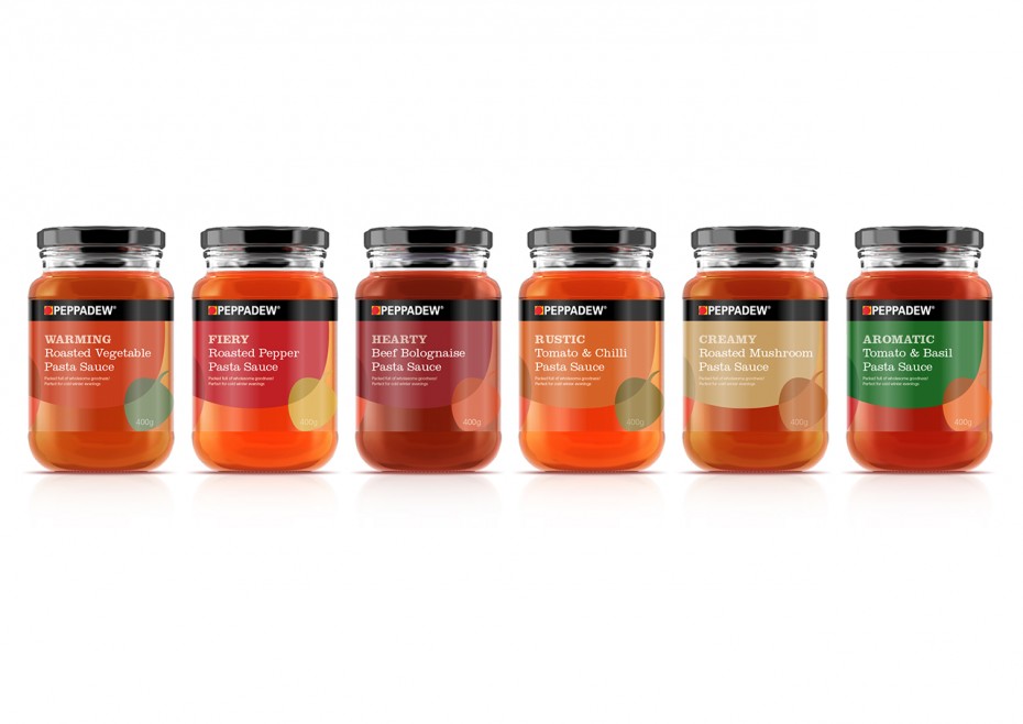
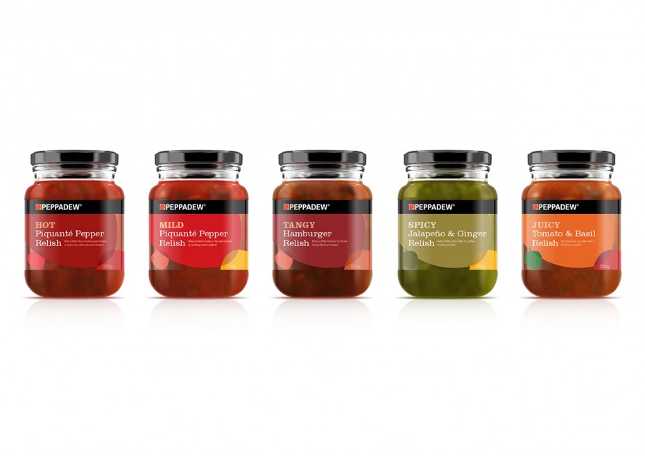
Without dispensing with much loved existing brand components, the new label design uses the existing Peppadew pepper, to create patterns and juxtapositions in a variety of ingredient inspired colour ways in order to produce a visually engaging look for the brand.
The intention is to ensure that the packaging is ownable and remains proudly Peppadew. While the brands core colours still feature heavily, a broader palette allows for exciting combinations which complement specific products and enhance their consumer appeal.

